By Guest Contributor
Background photo created by lifeforstock - www.freepik.com
When browsing through a website, we often take note of how the brand presents itself. We want a user-friendly experience that is hassle-free. The way a website is designed also impacts how long people stay on it. If your website is complicated and messy, some people might get frustrated and leave instead. Have you ever experienced that? On the other hand, there are some brands that know exactly how to design their websites to get users to stay. Aesthetically pleasing to the eye, here are some beauty brand websites that we would love to stay on forever.
Beauty Insider
Photo courtesy of the contributor (Click to enlarge)
If you don’t already know, Beauty Insider is one of the best websites to get the latest beauty news in Singapore. From hair to nails, body and makeup to skincare, Beauty Insider features everything you need to know. It first captures your attention with a slider featuring some of the latest news. Scrolling down, it has an easy-to-read layout of top-to-bottom and left-to-right with colours of pink and white. Making the website look clean and organised, as well as enjoyable to scroll through.
Photo courtesy of the contributor
Besides featuring all the latest beauty news in Singapore, they also have a platform that supports multiple beauty brands for you to purchase. Insider Mall is the best online beauty and makeup store in Singapore. Similar to the layout of Beauty Insider it also reads from top-to-bottom and left-to-right. Upon entering the website, you’re greeted with a variety of brands with a search bar right on top. Above that, it also shows you everything they offer. This is the order of how we normally read and Beauty Insider has taken advantage of that convenience.
Sephora
Photo courtesy of the contributor
When you think of Sephora, you already know that their signature colour is black and white. These two colours are elegant and signify it as a high-end beauty store. Once you enter their site, they even greet you to get your shopping on.
Photo courtesy of the contributor
Their website has a unique section called “Inspired at Sephora”, which gives users a chance to be featured on their website. This little design on their website also allows them to show customer reviews. Featuring people who have used products purchased from their website to create makeup looks, shows how much others enjoyed shopping on their website. Sephora has a very clean and sleek design that is comfortable. Most of their icons are larger than usual for better viewing.
LookFantastic
Photo courtesy of the contributor
LookFantastic is yet another beauty store in Singapore that has been available for the longest time. Offering a wide selection of beauty and cosmetic products we all love and enjoy, it is usually offering various deals and discounts. Although having a very simple design, it allows for a very quick scroll and brief overview of what they offer. The first thing you notice on their site is the two bars that state the discounts and free shipping.
Photo courtesy of the contributor
LookFantastic has a very straightforward site with an effective search bar and a navigation bar that is always present. The large slider stretching the length of the site stands out as it promotes some of its best deals. With a touch of pastel colours here and there, it gives a calming feeling.
Kylie Cosmetics
Photo courtesy of the contributor
Famous for her name alone, Kylie Jenner took the world by storm when she launched Kylie Cosmetics and allegedly “breaking the internet” minutes after launching. Upon entering the site, you are greeted with the face of the brand, Kylie Jenner herself. Filling up the site, it definitely captures our attention.
Photo courtesy of the contributor
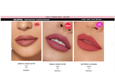
Now Kylie Cosmetics has an aesthetic design customised with small lips on the product images. Lipstick colours are featured on lips, which gives you an idea of how it looks but is also satisfying to look at. With amazing and high-quality product photography, the end of the page features three icons that lead you to specific categories. What’s interesting is that upon hovering over the icon, it turns black and white. Highlighting its luxury.
RE:ERTH
Photo courtesy of the contributor
RE:ERTH has gone for a very minimalistic and clean design for their website. The main colour of green, it represents the natural ingredients it uses. Upon entering the site, there is a slider filling the page. With call-to-action buttons, RE:ERTH added an additional button at the left-corner to promote their rewards program. To make it stand out from the rest, the icon has been deliberately covered in pink. Their navigation is also hidden to suit the clean look.
Photo courtesy of the contributor
The light pastel colours make the website easy on the eyes and once you scroll down, you can read about some of the ingredients they use. Since people are focusing more on what’s being put into the products they use, this is a great way to inform them.
Conclusion
Web design in Singapore is crucial and important for lead and sales generation. With an excellent website design, you can not only create a better user experience, as well as converting more users into customers. You have to make sure that you don’t underestimate the importance of a good website design. Based on how your website looks, it can help you create credibility and trust among customers. More customers mean more sales. If you want to enhance your website, check out Mapletree Media, a reputable web design company in Singapore. Only providing the best for their customers, they have a number of packages that are affordable. Turning “expectations into reality”, head on over to Mapletree Media now to contact them for more information!


No comments:
Post a Comment